With 62.87 million monthly internet users in the UK, it’s vital that your website serves its purpose.
In fact, it was recently revealed that it takes just 0.05 seconds for a visitor to judge your website – dictating whether they will stay or go.
And while an effective UX, interesting content and high-quality visuals are easy ways of ensuring your website is appealing to your customers, there is a science to optimising it for the best results.
Recent studies highlight the latest eye-tracking research, which reveal the ways in which people view a website.
They discovered ten useful findings to analyse how your website is viewed, and we’ve shared them with you in this blog post.
Optimise your website to fit the findings, and you’ll have done all you can to ensure any visitors to your site will stick around.
HOW PEOPLE VIEW A WEBSITE
1. ALL EYES ON THE TOP LEFT CORNER
As of 2021, the top left corner is still the area that is the most noticed.
If you’ve captured their interest, they will then make their way to other areas of the site, so it’s vital that this top left corner doesn’t put any potential customers off staying put on your page.
This eye-tracking study image shows exactly how this works:
If you check your website, will your customer see the most important value proposition of your site in the top left corner?
If not, it may be time to rethink the layout of your page. By making sure that the content you want to be most accessible is in the top left corner of the site, you’ve got the best chance of keeping visitors interested.
The Gutenberg diagram also highlights the general pattern the eyes follow when reading or looking at text-heavy content.
It neatly fits the zoning conclusion, excluding the bottom right area:
The fourth section should have your call to action in it. Keep in mind that this isn’t set in stone, but it’s a good starting point.
2. F-PATTERNS
Rather than reading, people will scan the content on a page.
So, if you add a text-heavy page to your website, other than a blog post, the chances are it’s not going to be read in full.
This is where short, snappy content works best – whether that’s adding bullet points, headers or clearly signposted links to more text-heavy pages if it’s of interest to the customer.
In fact, a study carried out six years ago concluded that only 28% of the text on a webpage is actually read, on average.
Eye-tracking visualisations show that users often read content in an F-shaped pattern: two horizontal stripes, followed by a vertical stripe:
This is the perfect example of why to have your value proposition in the top sections and have a menu either running horizontally along the top or running down vertically on the left-hand side.
3. VISIBLE INTRODUCTORY PARAGRAPHS
When writing an introductory paragraph, make the size of the font significantly larger than the other content or make it bold.
Within the test, when subjects encountered a story that used a bold introductory paragraph, 95% of them viewed all or part of it.
For example, every Smashing Magazine article begins with an intro paragraph:
Keep the paragraph line lengths short and in a single column, as that is how people are used to reading a text.
The font style is not a huge matter, but people quite like links – the number of clicks on the link increase as you add more links.
4. FIRST PRIORITIES
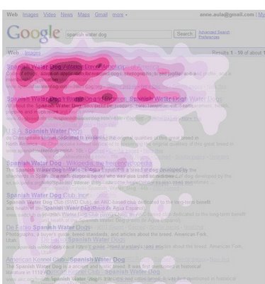
Unfortunately, if you are not in the top Google searches, your site will be losing out.
In an eye-tracking study by Google, a majority of users found what they were looking for in the first two results listed and did not need to look any further down the page.
As it is becoming increasingly harder to get into the top searches, using a long-tail keyword strategy is very important.
5. SCROLLING
Web users know how to scroll and look below the fold, but not half the amount as they look above the fold.
Ensure that your value proposition sits above the fold.
Do not try and squeeze all of your content in there.
Scrolling is still a better option than chopping lengthy content apart and dispersing it between pages, as it provides better usability.
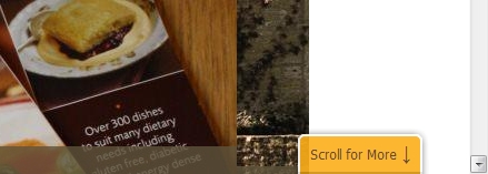
Just remember that you guide users to scroll down.
Wiltshire Farm Foods give a small hint in the bottom right corner:
Surprisingly, several studies have found that the very bottom of a page also gets quite a bit of attention – another good place for a call to action.
6. LEFT SIDE > RIGHT SIDE
As expected, people read from left to right, hence why the left side of the page gets the most attention.
Web users spend 69% of their time viewing the left half of a page and 30% of their time viewing the right half.
Amazon is a prime example of utilising the left side of the page, by putting their menu on the left-hand side:
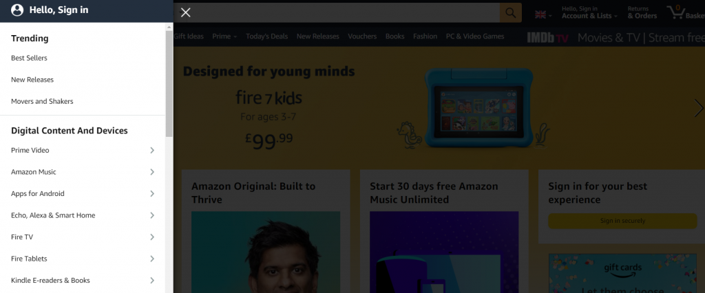
If you have a vertical menu, make sure you put it on the left.
However, navigation works best at the top of a page, as it was seen by the highest percentage of test subjects who spent the most time looking at.
7. VISUAL CONTENT
Using high-quality pictures on your website to make it visually pleasing, draws a significant amount of attention to your page.
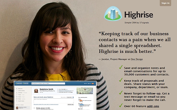
Having a picture of a person facing towards the camera is more inviting and approachable.
An example of a website that uses photos that fit these criteria is Highrise:
Small, indistinguishable images are less inviting, as are oversized glamour shots.
Usability Guru, Jakob Nielsen, said the eye-tracking study also surfaced a counter-intuitive finding that people who look like models are less likely to draw attention than regular people.
8. AMAZING APPLE
EyeTrackshop conducted a study that recorded consumers looking at a group of smartphones and tablets. They discovered that Apple’s iPhone 4S and iPad 2 gained the longest time of attention compared with other Google Android devices from Amazon, HTC, Motorola and Samsung.
A 2.3-second average was gained for the iPhone.
9. DOMINANT HEADLINES
Another eye-tracking study found that dominating headlines often catch the eye when first clicking on a page – especially if it is in the top left corner.
Try to present your entire value proposition within the headline, keeping in mind that clarity trumps persuasion.
Rekko greets its visitors with a domineering headline:
Featuring a cluster of headlines on a page will not be as effective as you think. Again, most often it’s the left sides of the headlines that gain most of the attention.
People will scan down the list rather than read the whole headline, picking out certain words. If those words are of interest, there is a higher chance they will read on.
10. FIRST IMPRESSIONS
When viewing a website, it takes users an average of two-tenths of a second to form a first impression of the site.
Research has found that people usually spend 2.6 seconds scanning through a website before focusing on a particular section.
The different sections of the website that drew the most interest from viewers were:
- The institution’s logo – Users spent about 6.48 seconds focused on this area before moving on
- The main navigation menu – Almost as popular as the logo, subjects spent an average of 6.44 seconds viewing the menu
- The search box, where users focused for just over 6 seconds
- Social networking links to sites such as Facebook and Twitter – Users spent about 5.95 seconds viewing these areas
- The site’s main image, where users’ eyes fixated for an average of 5.94 seconds
- The site’s written content, where users spent about 5.59 seconds
- The bottom of a website, where users spent about 5.25 seconds
So, now you know how people view a website, it’s time to turn that knowledge into action. The structure of your web page can determine whether a reader stays and scrolls, or clicks that left pointing arrow back to search.
But when it comes to website design, there’s a lot of technical jargon thrown about, making it difficult to decipher the steps you need to take to optimise your site. That’s where we can help. Our website services are based on user behaviour and, ultimately, getting you conversions. When you’ve spent all that time crafting high-quality content, don’t risk losing out because of format.
To chat with one of our team about developing your website, give us a call today on 0121 638 0457.
- Marketing Managers Can’t Be Your Marketing Department - January 11, 2025
- Tagging Strategies: How They Maximise Your Marketing Campaigns - January 7, 2025
- First Step to Creating Killer Content – Know Your Reader! - January 7, 2025


