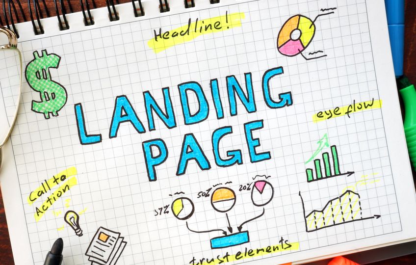
The most successful landing pages are simple and resonate with the right audience.
Below, we’re sharing tips on how you can take your landing pages to the next level to draw in prospects. We’ll show you how to use headlines, colour, copy, and placement to create the perfect landing page!
Writing Strong Headlines
Headlines and Ad Copy
The headline and advertisement wording should complement each other on a landing page. If using AdWords, your score allows the site to discover the cost-per-click. This can be increased by being consistent with your content between the advertisement message and landing page text.
Be Clear
As the headline is the first thing a visitor will read, landing page headlines shouldn’t be unclear or too long; they should make visitors want to take a closer look. Address a specific point that is related to the content on the website as this will catch the reader’s attention as opposed to a vague headline.
Grammar
The grammar used on your website should be consistent and flawless, not just on a landing page. Ensure that you are double checking content before sending it out, or even have another person read it through. When thought about, you are asking visitors to trust you, but that can be risked if there are any spelling errors or sloppy grammar.
Trust Indicators
An effective way of building trust could be through incorporating testimonials, reviews, press mentions, guarantee seals, and 3rd part trust and security certifications (VeriSign etc.).
Some statistics: ACLens, an eyeglass and lens company, started to use VeriSign and saw a 41% increase in conversions and a 58% increase in revenue per transaction. It is possible for the same thing to happen with any online landing page.
Call-To-Actions
Strong Call-To-Actions
It is integral for a landing page to have a strong call-to-action. Be specific about what the call-to-action will lead them to without using too much written wording.
Some statistics: In the case of Mozilla FIrefox, when they changed their call-to-action from “Try Firefox 3” to “Download Now – Free”, it outperformed the original call-to-action by 3.6% and had a confidence level of over 99%, resulting in over 500 more downloads while the test was taking place.
Make Them Bold
Identify the keywords people interested in your service might be searching for and use works such as ‘free’, ‘new’, ‘download now’, and ‘buy’. A conversion button should stand out and be placed right below a call-to-action or the call-to-action should be the button itself. It is important that your button is bold, bright and above the fold – which we’ll be covering in the next section.
Placement and Content

The Fold
The space and information your website visitors see, without having to scroll, is considered to be ‘above the fold’ and is where all your important parts of the web page should be. Placing the call-to-action button above the fold makes it easier for the viewer’s eye to locate, rather than having it somewhere that has to be actively searched for.
Test, Test, Test
Optimise a landing page for conversion over time. Make sure you are running A/B tests, altering copy, images, and call-to-actions to see what resonates most with users. In addition to A/B testing, testing two completely different site designs against each other will be beneficial in the long run.
Relating Images
If you are implementing videos of user testimonials and product images into a homepage, make sure that it is relevant to the specific product/service it is associated with. Used correctly, it can have a positive impact on viewers, as well as give shoppers an extra push to look further into a product.
Links
Don’t overload a user with links that connect them to loads of different sites or pages as this will only serve as a distraction and have a negative impact on conversions. You can include a lot of links on a homepage, but it’s important to keep it simple on landing pages.
Colours

Colours that are appealing to customers will vary among different websites. Using the correct colours can impact the amount of traffic you draw in. They ultimately set the mood of a landing page and have the ability to influence a viewer’s actions; see below which colours translate what!
- Yellow: Optimistic and youthful – often used to grab the attention of the viewer
- Orange: Can be an aggressive colour – used as an attention grabber and call-to-action
- Red: Energitic and creates a sense of urgency – most often associated with clearances and sales
- Pink: Romantic and feminine – used most for marketing products to women and young girls
- Blue: Creates sensation of trust and security – most often used by banks and businesses
- Purple: Soothing and calming – used in correlation with beauty and anti-ageing products and services
- Green: Associated with wealth – the easiest colour for the eye to process and is often used with entertainment or finance websites
- Black: Powerful and sleek – associated with luxury and sophistication
Incorporating Forms
If you’re considering where you should be incorporating a form, or if you should incorporate one at all, we can give you guidance. Once you have done everything right for your landing page and the user has clicked on your call-to-action, you will need a way to capture their information.
Contact us today for a free online marketing review!
- Social Media Marketing – In Reality - November 28, 2024
- How to Manage Your Digital Marketing and PR During a Christmas Closure - October 22, 2024
- Understanding Strategy – Beyond the Buzzword - October 22, 2024

